
Templates
Start from a pattern,
not a blank page.
Urmi ships with 40 section patterns and 7 starter sites. They pick up your Design System the moment you insert them, so a new page looks like your site from the first click.
01 In the editor
A library that lives
next to your canvas.
Open Insert → Sections to browse the patterns by category or search them by name. Click one and it lands on your page, styled with your Design System — colors, fonts, buttons and spacing.
6
Column layouts for a quick empty structure.
40
Section patterns in 11 categories.
7
Starter sites with pages, header and footer.
[ ]
Placeholder copy in brackets, so nothing ships by accident.
02 Every pattern
The full catalogue,
as the patterns come.
Each preview is a built-in pattern inserted on a page with its placeholder text and images — the parts you replace with your own. On your site it picks up your Design System.
Headers
2 patterns

Centered logo
Sticky header with the logo in the center, the main menu on the left and a call-to-action button on the right.

Logo, menu and button
Sticky site header: logo on the left, the main menu in the middle (a hamburger on tablets and phones) and a call-to-action button on the right.
Heroes
4 patterns
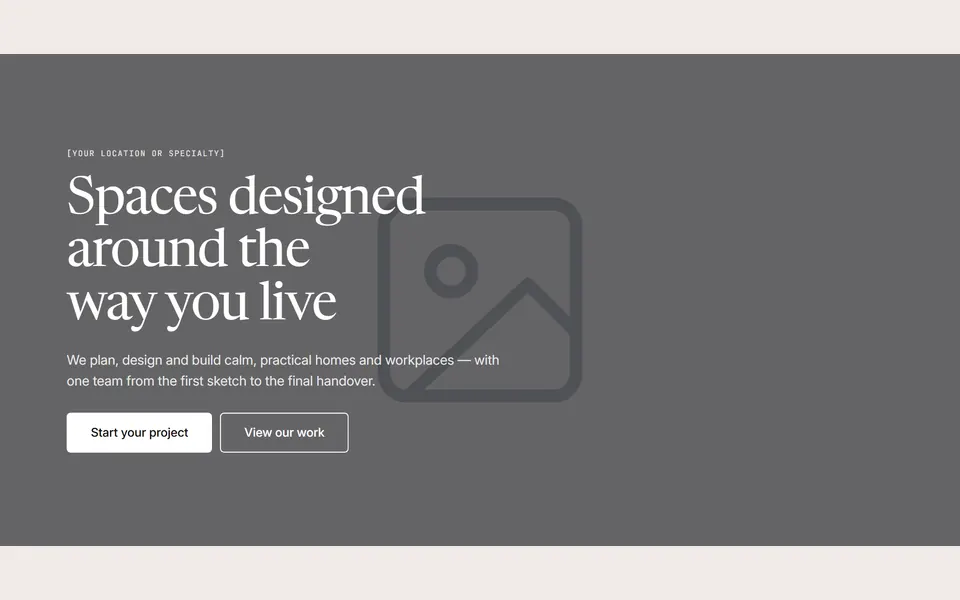
Full-width background image with overlay
Tall hero with a full-bleed background image, a dark overlay for contrast and white text: eyebrow, h1, lead paragraph and two buttons.
Centered with badge and two buttons
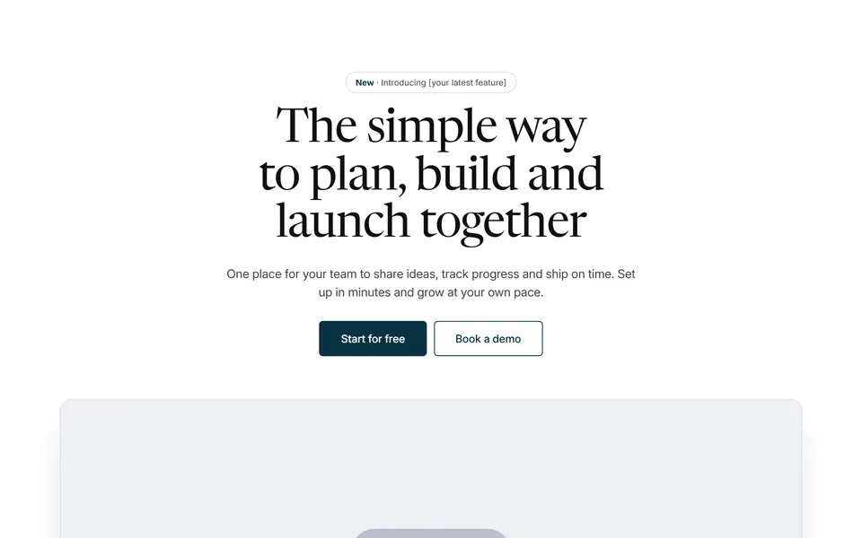
Centered hero with an announcement badge, a large h1, a lead paragraph, primary and secondary buttons and a wide product image underneath.
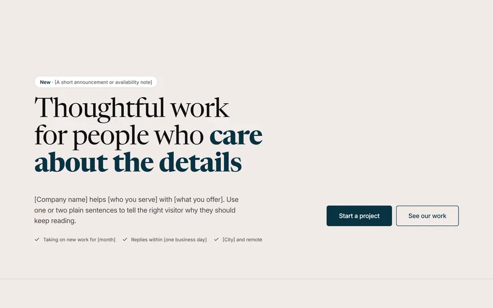
Minimal, text only
Typographic hero without an image: a small pill badge, an extra-large left-aligned h1 with a highlighted phrase, then the lead paragraph on the left and two buttons on the right, and a short inline trust list.
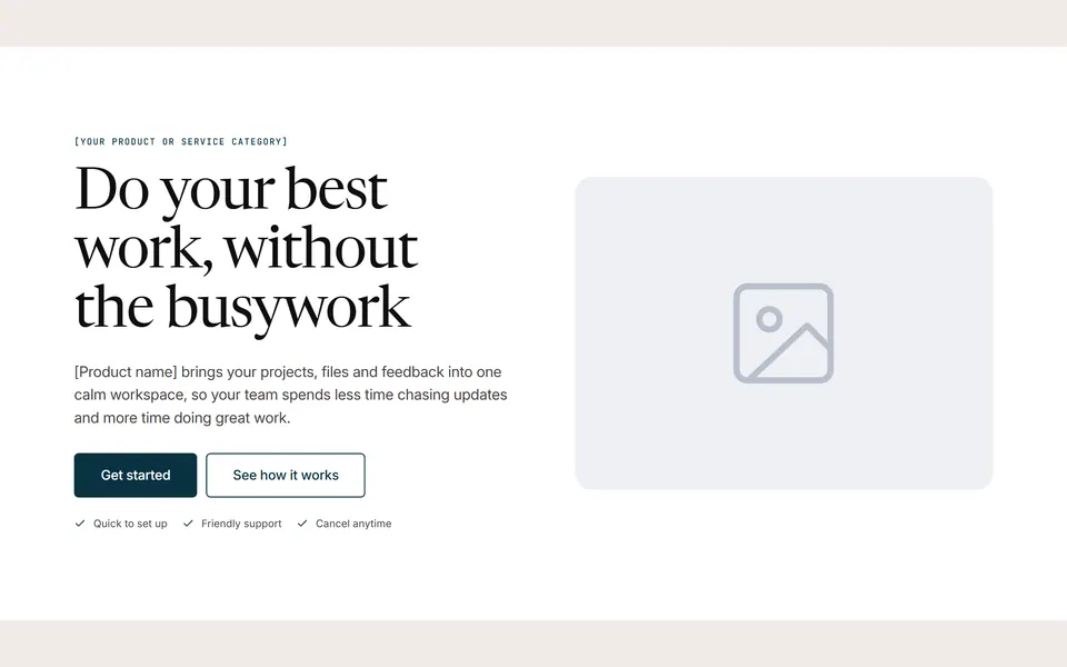
Text and image side by side
Split hero on a surface background: eyebrow, h1, supporting paragraph, two buttons and a short reassurance list on the left, a large rounded image on the right.
Features
6 patterns
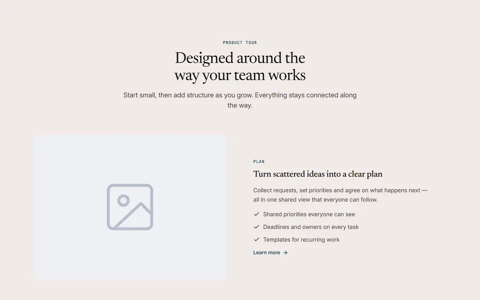
Alternating image and text rows
Centered intro and two feature rows that alternate image and text sides (image on top on phones).
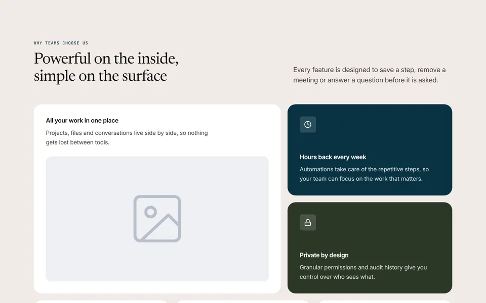
Bento grid
Split intro (title left, text right) and a bento grid: a large image tile beside two stacked colored tiles, then three compact Icon Box tiles.

Text with checklist card
Two columns: eyebrow, h2, a short paragraph and a button on the left; a rounded surface card on the right with an h3 and six check-marked benefits in two columns.
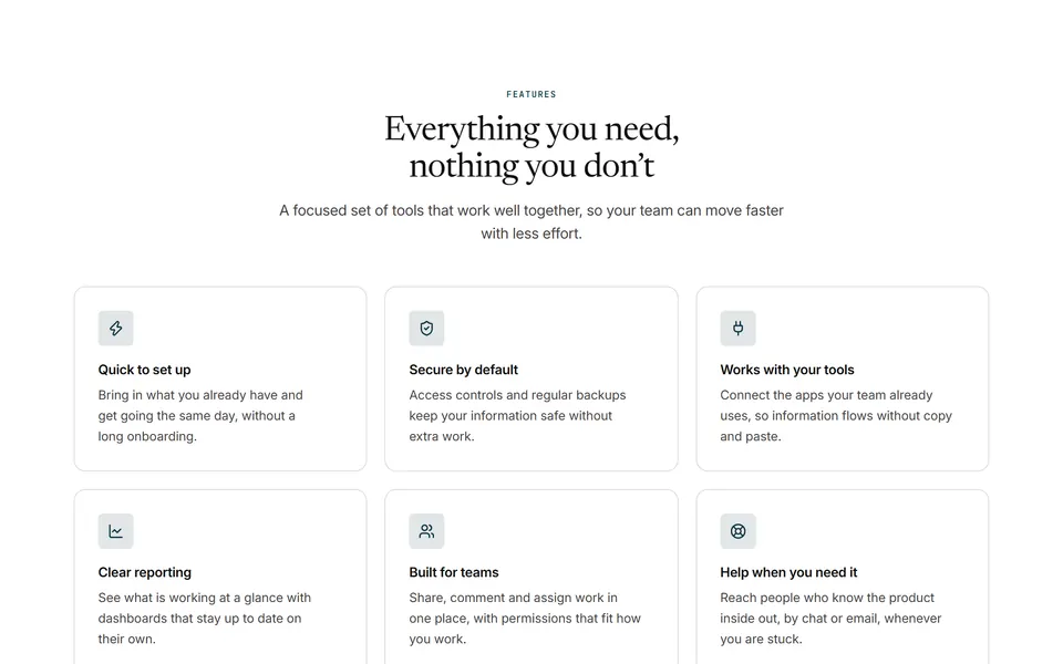
3-column icon cards
Centered intro followed by six feature cards (icon, h3, short description) in a 3-column grid — 2 columns on tablets, 1 on phones.
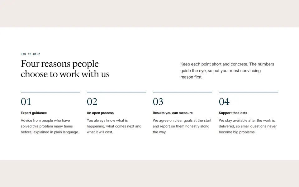
Numbered grid
Split intro (title left, text right) and four numbered points (large 01–04 number, h3, short text) with a colored top rule, on a surface background.
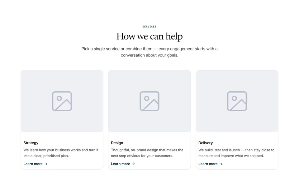
Image cards with links
Centered intro and three linked service cards (image, h3, description, “Learn more”).
Social proof
6 patterns
Logo strip
Compact band with a short label and a row of six customer or partner logos (grayscale until hovered).
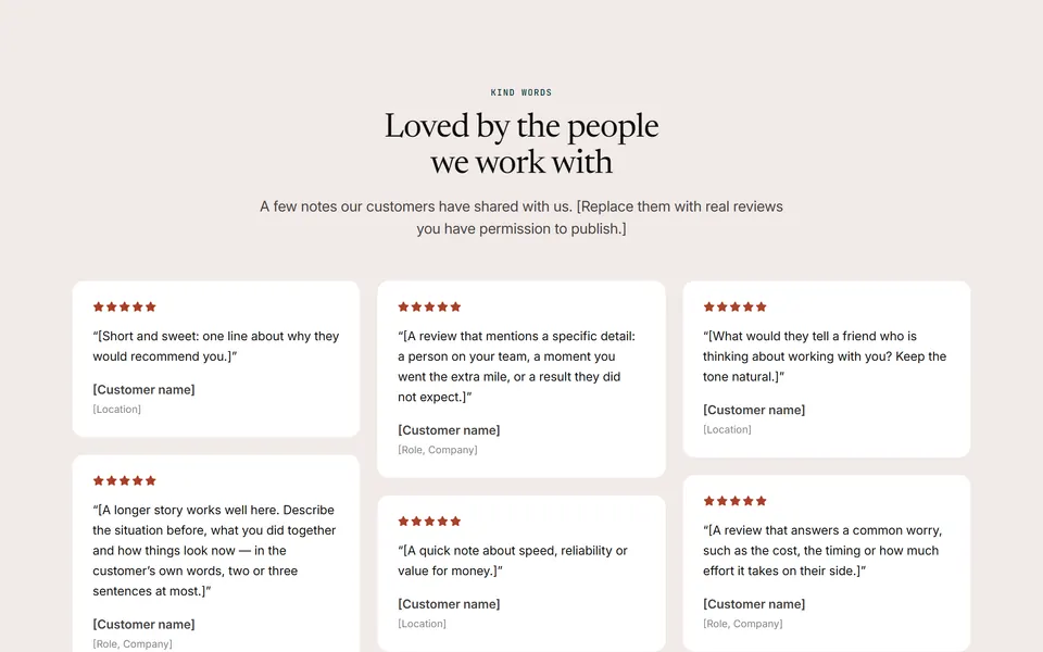
Masonry wall
Centered intro and a masonry-style wall of six soft review cards (stars, quote, name, role or location) of different lengths in three columns.
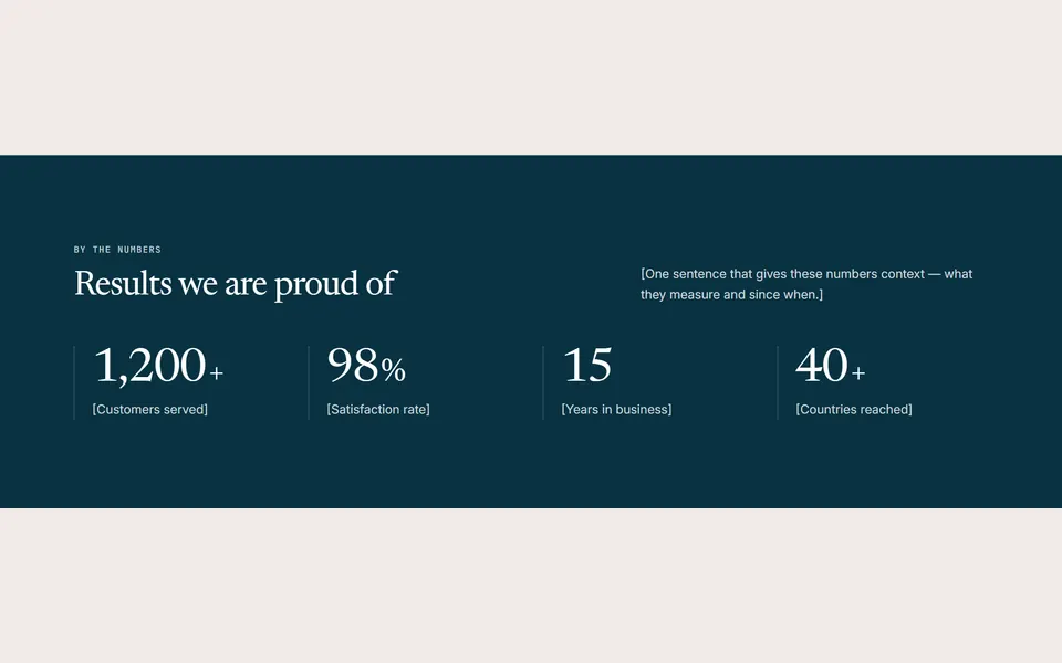
4 numbers
Primary-colored band with an intro (h2 + short text) and four animated counters.
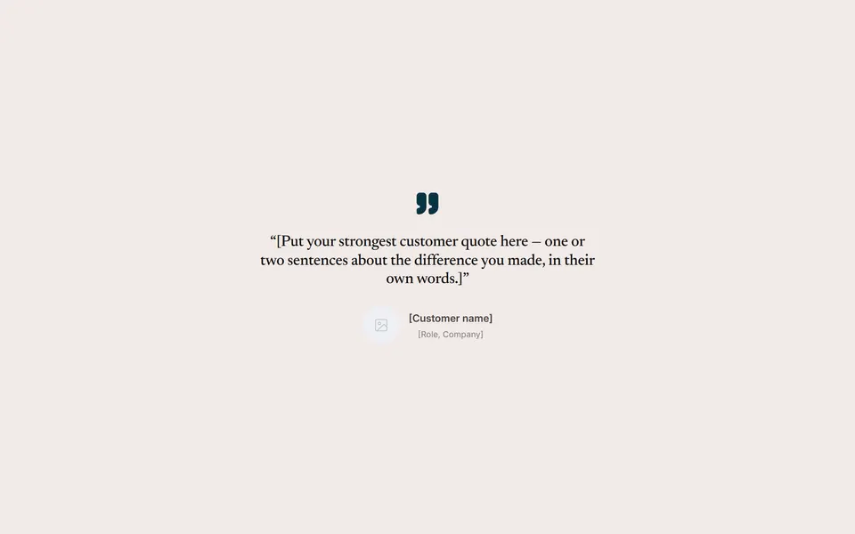
Large single quote
One large, centered customer quote with a quotation mark, the customer’s name, role and photo.
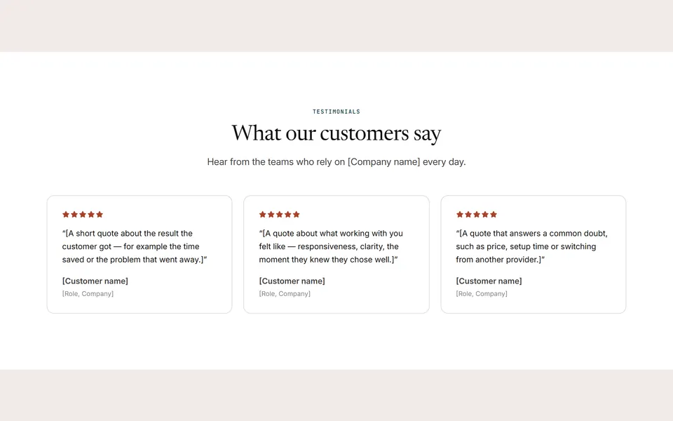
Three cards
Centered intro and three testimonial cards (stars, quote, name and role) in a 3-column grid — 1 column on tablets and phones.
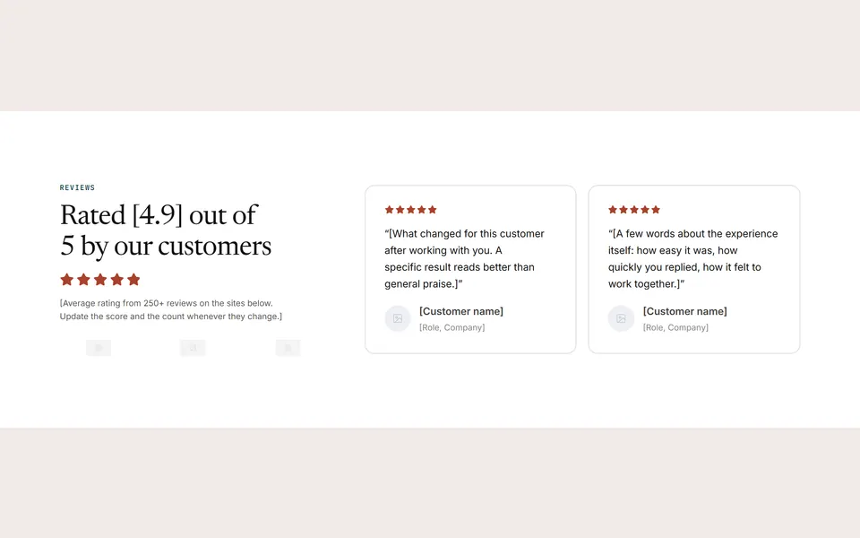
Rating summary with logos
Surface band with a rating summary on the left (h2 with your average score, a Star Rating widget, the number of reviews and three review-site or press logos) and two testimonial cards with photos on the right.
Pricing
2 patterns
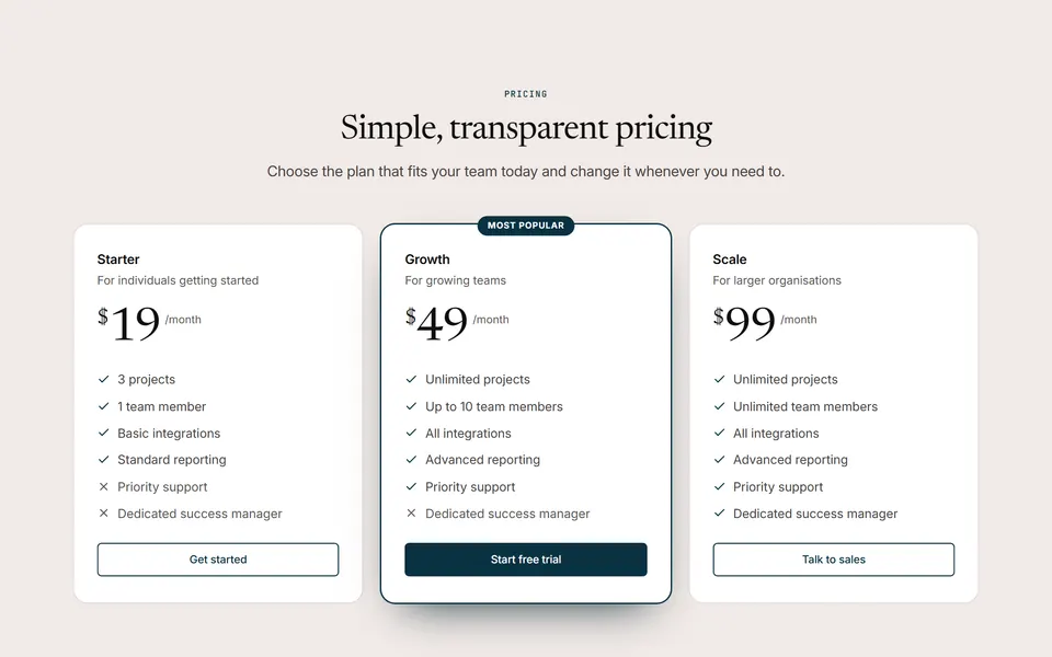
Three plans, middle highlighted
Centered intro and three pricing plans with the same feature rows; the middle plan is highlighted with a “Most popular” badge.
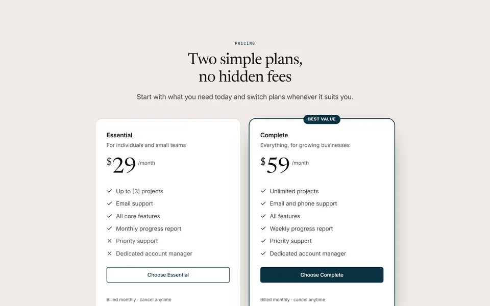
Two plans side by side
Centered intro and two pricing plans side by side in a narrower centered block (max 880px); the second plan is highlighted with a “Best value” badge.
FAQ
2 patterns
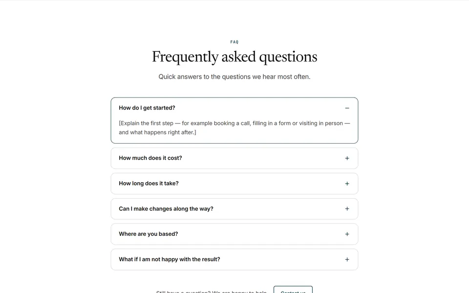
Centered accordion
Centered FAQ on a surface background: eyebrow, h2 and lead, a single accordion of six questions (h3) in a narrow centered column (max 760px), and a “Still have questions?” line with a contact button.
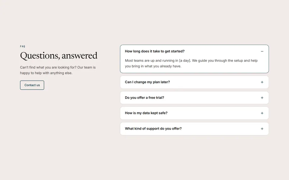
Intro and accordion in two columns
Two-column FAQ: title, short text and a contact button on the left; an accordion with five questions (h3) on the right.
Call to action
4 patterns
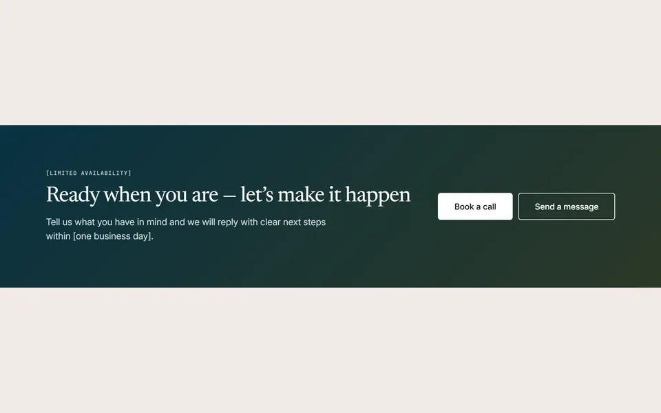
Gradient banner
Full-width band with a diagonal primary-to-secondary gradient and white text: eyebrow, h2 and one sentence on the left, a light button and an outline button on the right.
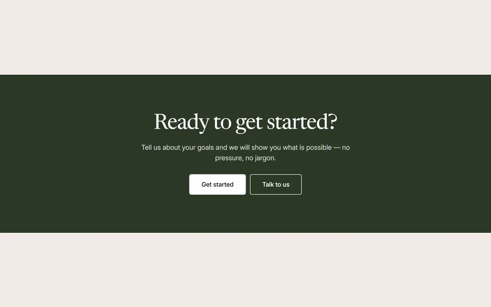
Dark band
Full-width dark band (secondary color) with a centered h2, one supporting sentence and two buttons — a light primary button and an outline button.

Newsletter sign-up card
Rounded primary-colored card with a mail icon, an h2 and a short promise on the left, and an inline sign-up form (one required email field and a light Subscribe button) with a “No spam / Unsubscribe anytime” note on the right.
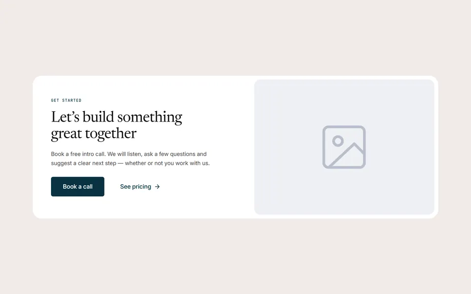
Card with image
Rounded surface-colored card with an h2, a short paragraph and two buttons on one side and an image on the other.
Content
7 patterns
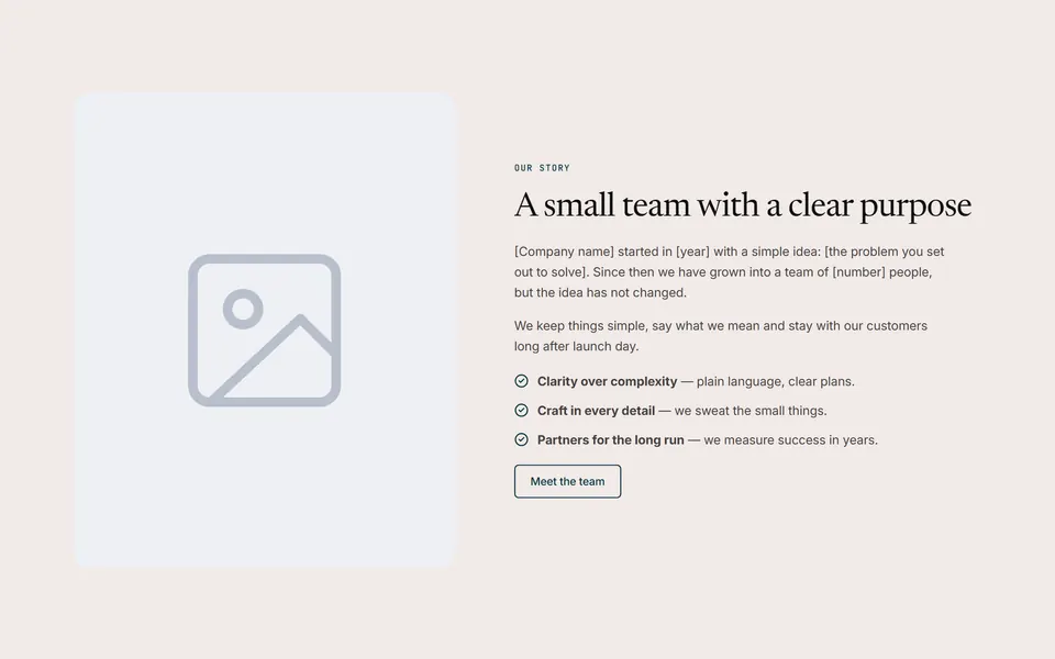
Our story with image
About section with a tall rounded image beside the story: eyebrow, h2, two short paragraphs, a list of values and a link button.
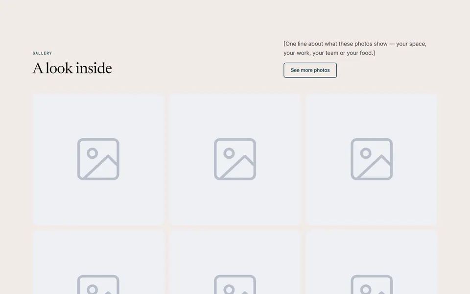
Photo gallery grid
Split header (eyebrow and h2 on the left, a short line and an outline button on the right) above an Image Gallery widget: six square rounded photos in a 3-column grid that open in a lightbox — three columns on tablets, two on phones.
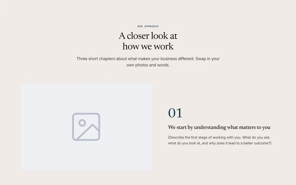
Zigzag story rows
Centered intro and three numbered chapters (large 01–03 number, h3, paragraph) beside wide 3:2 photos, alternating left and right; image on top on phones.
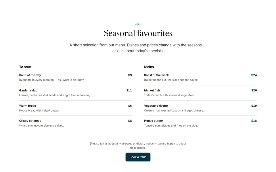
Menu or price list
Centered intro on a surface background and two Price List widgets side by side, each under an h3 group title: four items with a name, a short muted description and a right-aligned price, divided by thin lines.
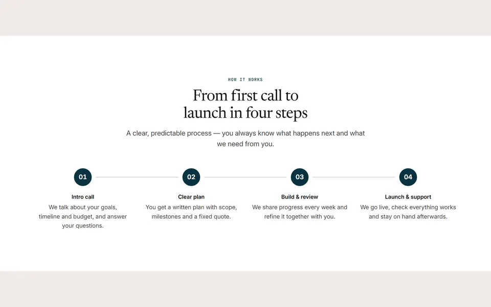
Four steps
Centered intro and a numbered, horizontally connected four-step process (stacks vertically on phones).
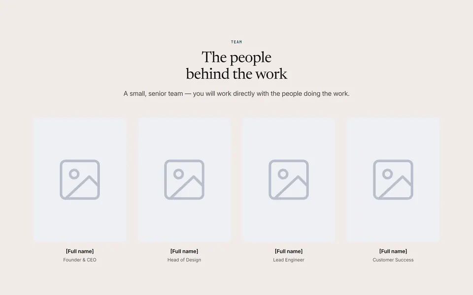
Four people
Centered intro and a grid of four team members (photo, name, role): 4 columns on desktop and tablets, 2 on phones.
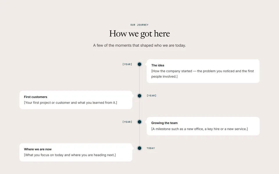
Company milestones
Centered intro and an alternating vertical timeline of four milestones (date, title, text).
Contact
2 patterns
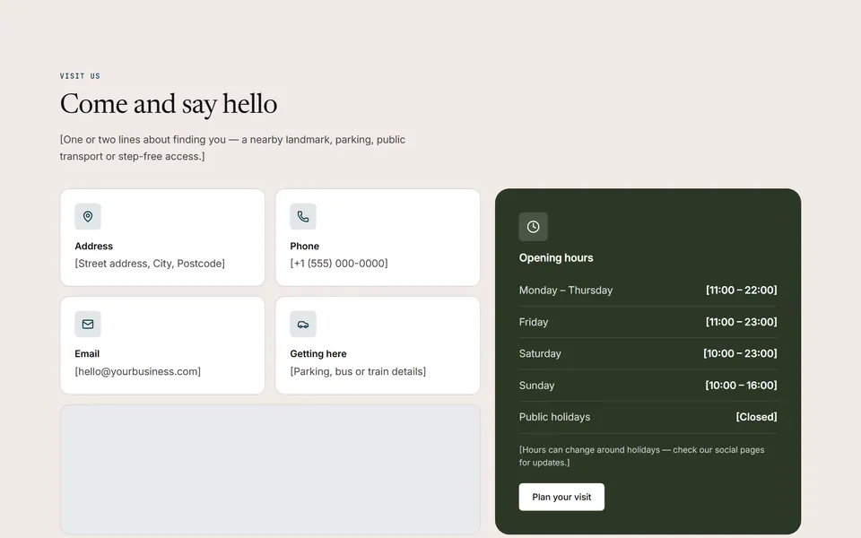
Info cards, map and opening hours
Visit-us section: eyebrow, h2 and directions text above four white contact cards (address, phone, email, getting here) in a 2×2 grid with an embedded Google map below them, and a dark opening-hours card with day/time rows, a note and a button beside them.
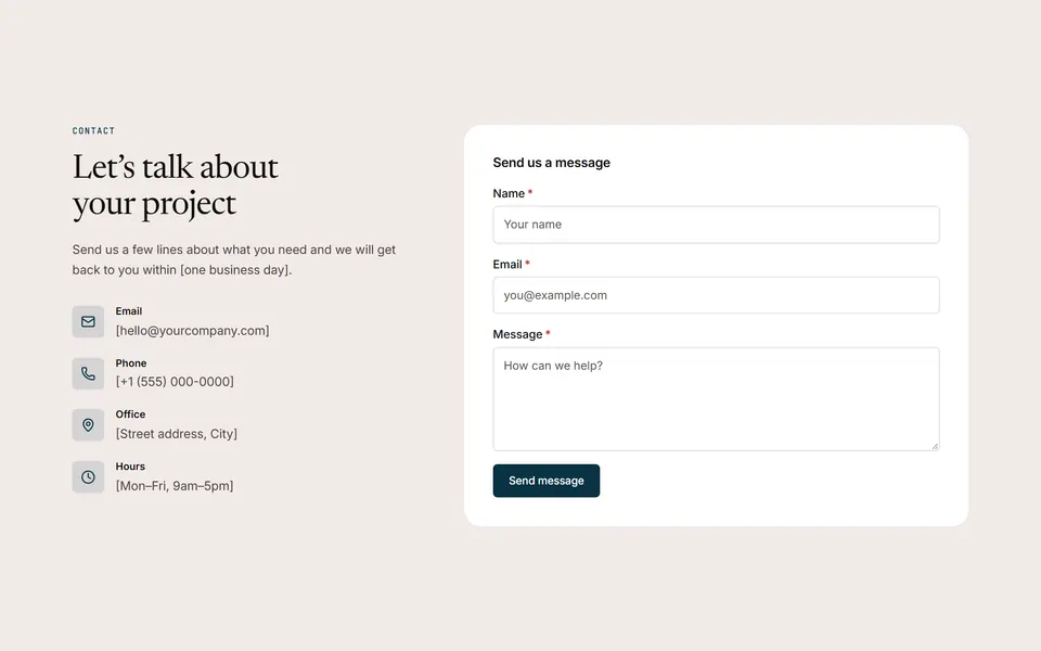
Details and form
Contact section: h2, intro and contact details (email, phone, address, hours) on the left; a contact form in a surface card on the right.
Blog
2 patterns
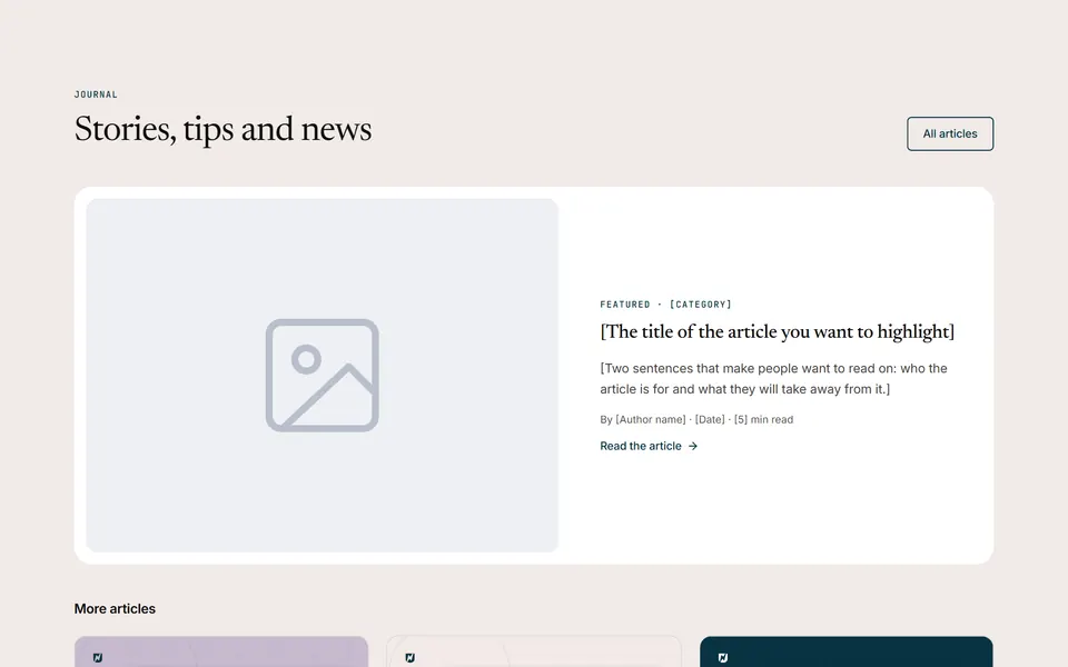
Featured post and latest posts
Section header with an “All articles” button, one large featured-article card on a surface background (image beside category, h3 title, summary, author line and a read link), then “More articles” with the three latest posts pulled automatically by the Posts widget.
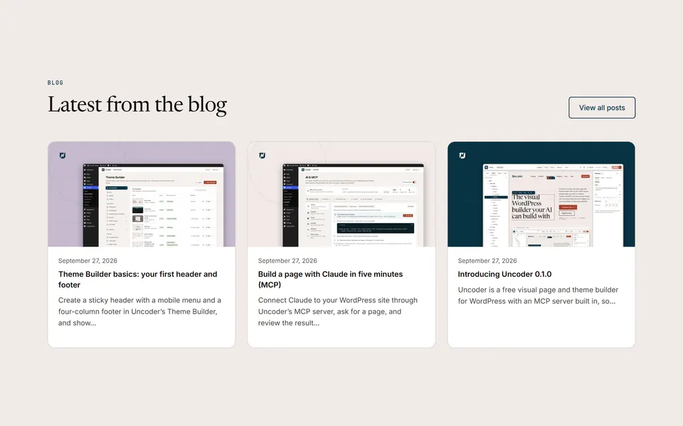
Latest posts
Section header (h2 with a “View all posts” button) and the three latest blog posts as cards (image, date, title, excerpt), pulled automatically with the Posts widget.
Footers
3 patterns
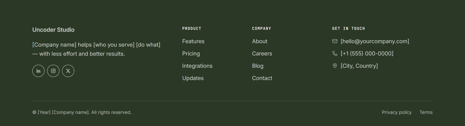
Four columns, dark
Dark footer: site name, short description and social links, three link columns, and a bottom bar with copyright and legal links.
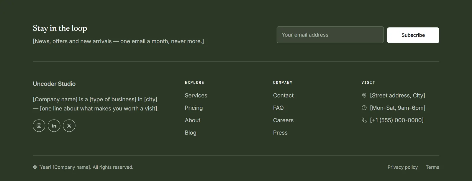
Newsletter band and columns, dark
Dark footer that opens with a newsletter band (title, one line and an inline sign-up form with an email field and a light Subscribe button), then the site name with a short description and social links beside three columns (two link lists and visit details), and a bottom bar with copyright and legal links.

Simple, light
Compact light footer: logo, a single row of links and social icons, then copyright and legal links.
03 Starter sites
Or start
with a whole site.
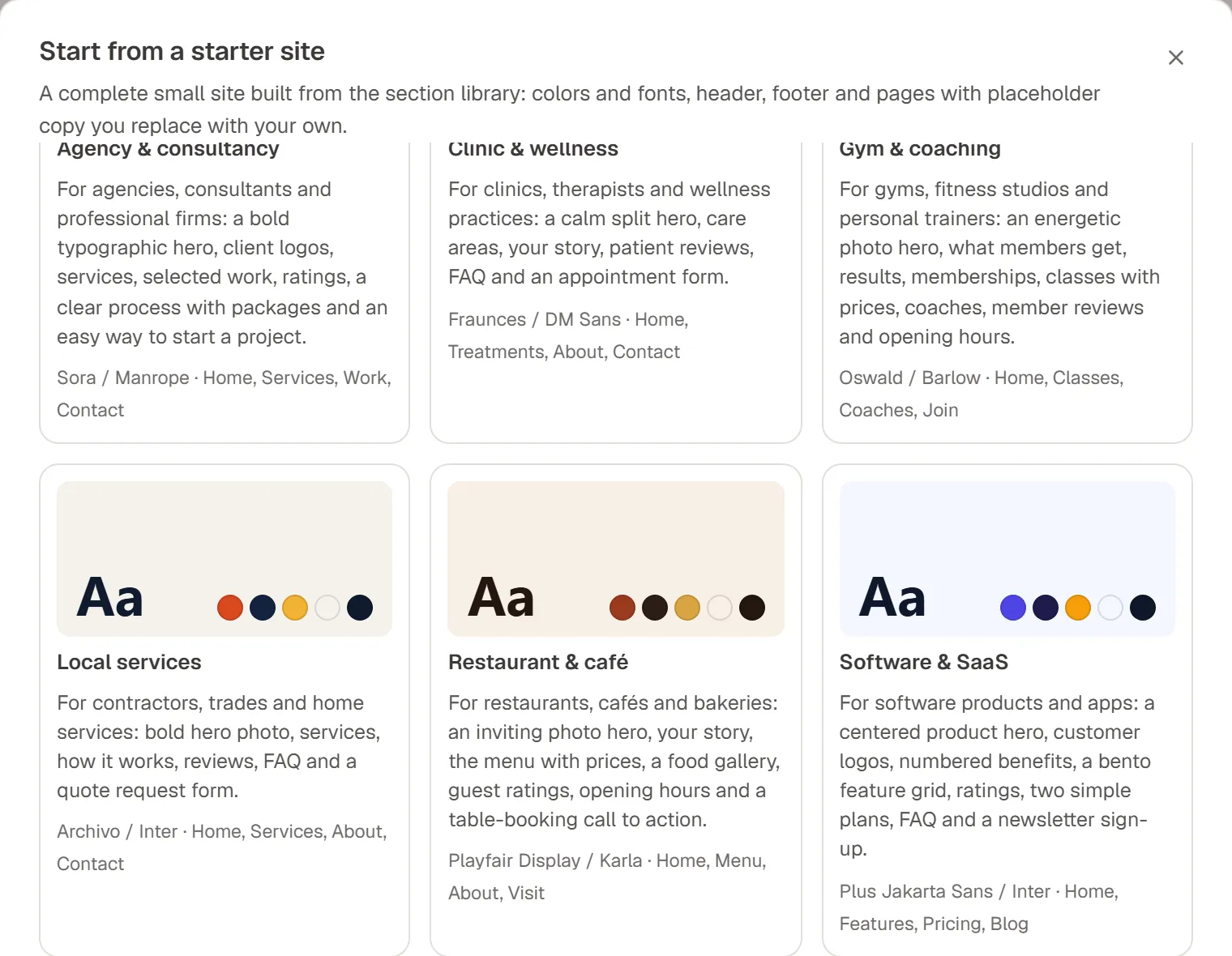
Seven starter sites combine the patterns into complete websites, each with its own Design System, a header, a footer and four or five pages. Pick one from the Urmi home screen; pages arrive as drafts for you to make your own.
Agency & consultancy
A bold typographic hero, services, selected work, a clear process with packages and an easy way to start a project.
Home, Services, Work, Contact
Clinic & wellness
A calm split hero, care areas, your story, reviews, FAQ and an appointment form.
Home, Treatments, About, Contact
Gym & coaching
An energetic photo hero, memberships, classes with prices, coaches and opening hours.
Home, Classes, Coaches, Join
Local services
A bold hero photo, services, how it works, reviews, FAQ and a quote request form.
Home, Services, About, Contact
Restaurant & café
An inviting hero, your story, the menu with prices, a food gallery, opening hours and table booking.
Home, Menu, About, Visit
Software & SaaS
A centered product hero, numbered benefits, a bento feature grid, two plans, FAQ and a newsletter sign-up.
Home, Features, Pricing, Blog
Creative studio
A confident centered hero, a bento feature grid, selected services, a big client quote and a journal.
Home, Services, About, Journal, Contact
Your own kits
Export any Urmi site as a site kit and import it on the next project, with every link and id pointed at the new site.
Pick a starter site from the Urmi home screen. Its colors and fonts can update your Design System, and its header, footer and pages arrive as drafts.
04 Reuse
Make your own
patterns.
Save any section
Right-click a section and choose “Save as template”. It appears under Saved sections in the Insert panel on every page.
Components with properties
Turn a saved section into a component: expose its heading, image or link as properties, and every placement can change just those.
Edit once, update everywhere
Embed a saved section with the Template widget and changes to the original appear on every page that uses it.
Patterns for your AI
Connected AI apps can list and insert the same patterns through MCP, so pages they build start from the same tested layouts.